UX designer at Swedish Social Service
Developing new IT features for case managers to help assist them in their daily work. Presenting two projects.

Introduction
As a UX designer at the Swedish Social Security Service, I have been fortunate to contribute to improving the IT systems for case managers. It is an intriguing journey, particularly as we transitioned the system to the web, introducing new opportunities and challenges. My role as a UX designer encompasses a broad range of responsibilities, from making pixel-level changes in high-fidelity mockups to conducting needs analyses and crafting effective messages.
While I am unable to provide specific details or visuals due to security reasons, I would like to highlight two significant projects that I have been involved in: the uploading tool for digital documents and the redesign of the journal tool.
Uploading digital documents
This project aimed to enhance the process of uploading documents from users’ computers directly into the IT system. Currently, there was no way for case managers to do this.
Testing and results
To ensure user-centric design, my colleague and I conducted rapid prototyping sessions with case managers, allowing us to gather crucial insights. Using scenario-based testing, the whole user flow was covered, from getting an email from a customer until the document was uploaded in the IT system to a case.
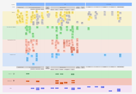
A user journey map was made, addressing pain points and high points during the use of the prototype. Some notable findings from these sessions included the need for a drag-and-drop feature, concerns about file storage locations before uploading, confusion regarding uploading only one document at a time (due to security reasons), and lack of confirmation when a document was uploaded.
Iterations
Based on the result of testing and through discussions with my UX team, we decided to implement a drag-and-drop function. Additionally, we incorporated dynamic text on buttons to the box to clarify the limitation of uploading one file at a time. We also introduced a visual indicator to show the file had uploaded after uploading. A new feature was also added that made it possible to preview the document that was attached.
Subsequent tests with these new implementations yielded promising results, as users found the features easy to use and intuitive.
Key takeaways
This project, for me, reinforced the importance of effective collaboration with developers and testers. It emphasized the need for clear and concise communication, explaining the design choices and the rationale behind the proposed changes, which were often derived from user testing. Furthermore, it highlighted the significance of analyzing user behavior beyond their verbal feedback, focusing on their on-screen actions to gain true insights into their experiences.
Redesigning a digital journal
In this project, I and my UX college redesigned the journal tool, one of the most widely used tools for case managers to track and document their decisions. We engaged early with users to understand their needs and gather feedback on the already existing version.
Needs analysis
The needs analysis was made with 12 case managers. We let them describe out load trying to explain why and how they did work with the Our analysis of user behavior with 12 case managers resulted in a comprehensive journey map, capturing the motivations and triggers for using the journal, as well as how it was utilized and its impact on subsequent actions.
- Insecurity about how to use short commands (improvement).
- The popup for writing text is annoying and users have trouble finding it again (improvement).
- The layout for already existing posts is distinguishable because of its distinction in color (positive).
- A lot of the features that existed in the old journal were not used (insight).

Prototyping and testing
Based on the research material, we developed three distinct prototypes: a basic version similar to the existing one but with some added features, a medium version with innovative ideas, and a more radical prototype pushing boundaries. Focus was also to make a familiar journal as we were dealing with white expert users that know the existing journal very well.
Users were involved in testing all three prototypes, given scenarios to find specific posts and create new ones. After every task, users were asked to score the prototype on how easy it was to use. We consolidated the most promising elements from each prototype into a final version which is now in development. Listed some of the most crucial design decisions.
- No more popup windows to write in, instead we incorporated the writing box right into the rest of the journal with the ability to close and open it.
- Flexibility, giving the users ability to take drag out the journal from the system to manage it on a second screen
- Flexibility, giving the users more freedom to compress posts (as they can be very long) to faster navigate and find older ones.
- A cleaner look, removing features that are not used and putting others in context menus, resulting in a less demanding interface.
Key takeaways
This project emphasized the power of prototyping to enable users to perceive differences and articulate their preferences, offering valuable insights. It also underscored the importance of clear and concise communication of user needs to the development team, placing the user at the forefront of the design process.